When I was a child, I thought I would become a veterinarian. Later, maybe an astronaut. Or a pilot. Instead, I became a software engineer.
I never really doubted that I wanted to build things and understand systems. I was lucky: there was always a computer at home, starting with an old IBM 8086. To me, computers were never just machines. They were infinite boxes where I could exercise curiosity without end. I could open them, explore them, break things, fix them, and keep learning. That impulse is still in my DNA.

Sueños - Source: Own
Over time, another thread became stronger in my life. Around 2017, I decided to become vegetarian for ethical reasons. It was not a dramatic gesture. It was a quiet attempt to live in a way that felt more coherent with what I believe. Since then, I have felt more aligned with myself.
And yet, for years I kept feeling a tension: I was building technical skills, but not always applying them where they meant the most to me.
I have long wanted to put my energy, knowledge, and experience into work that helps the planet and the beings that live in it. I have tried, more than once, to move toward organizations working for environmental or social good. So far, I have not had that opportunity.
Still, something changed in the last few summers.
I have been spending time in the south of Lima, and for reasons I do not fully understand, I reconnected deeply with the South Pacific: its birds, its fish, its marine life, its rhythms.
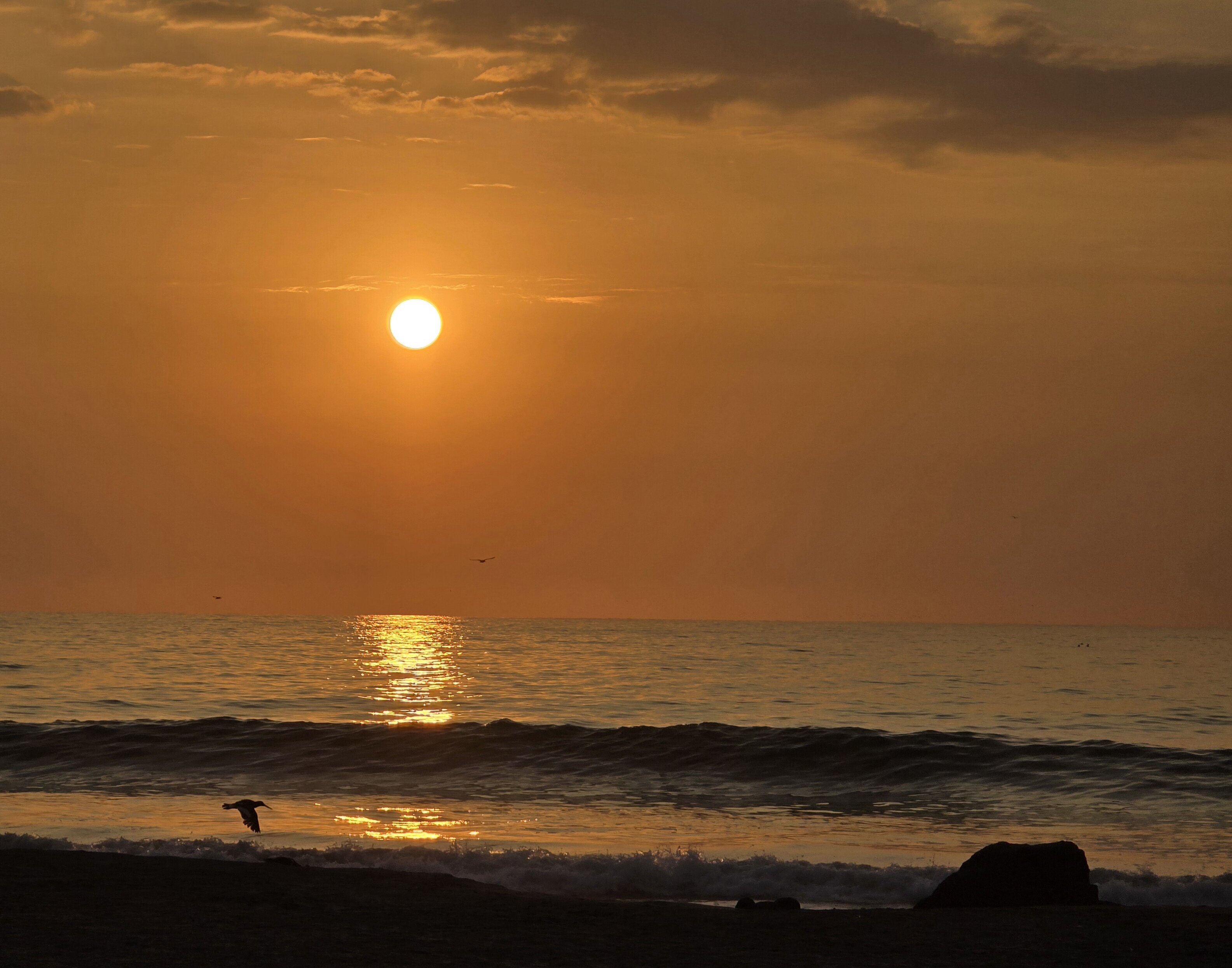
Sunset - Source: Own
The place where I stay has a balance that fascinates me. There are few humans, a lot of non-human life, and, most of the time, a kind coexistence that gives me hope. I have seen oystercatchers nesting on the sand while beachgoers quietly step away so they do not disturb them. That matters to me. It reminds me that coexistence is possible. It also awakened something: the desire to try again to contribute, even in a small way, to restoring that balance where it has been damaged.
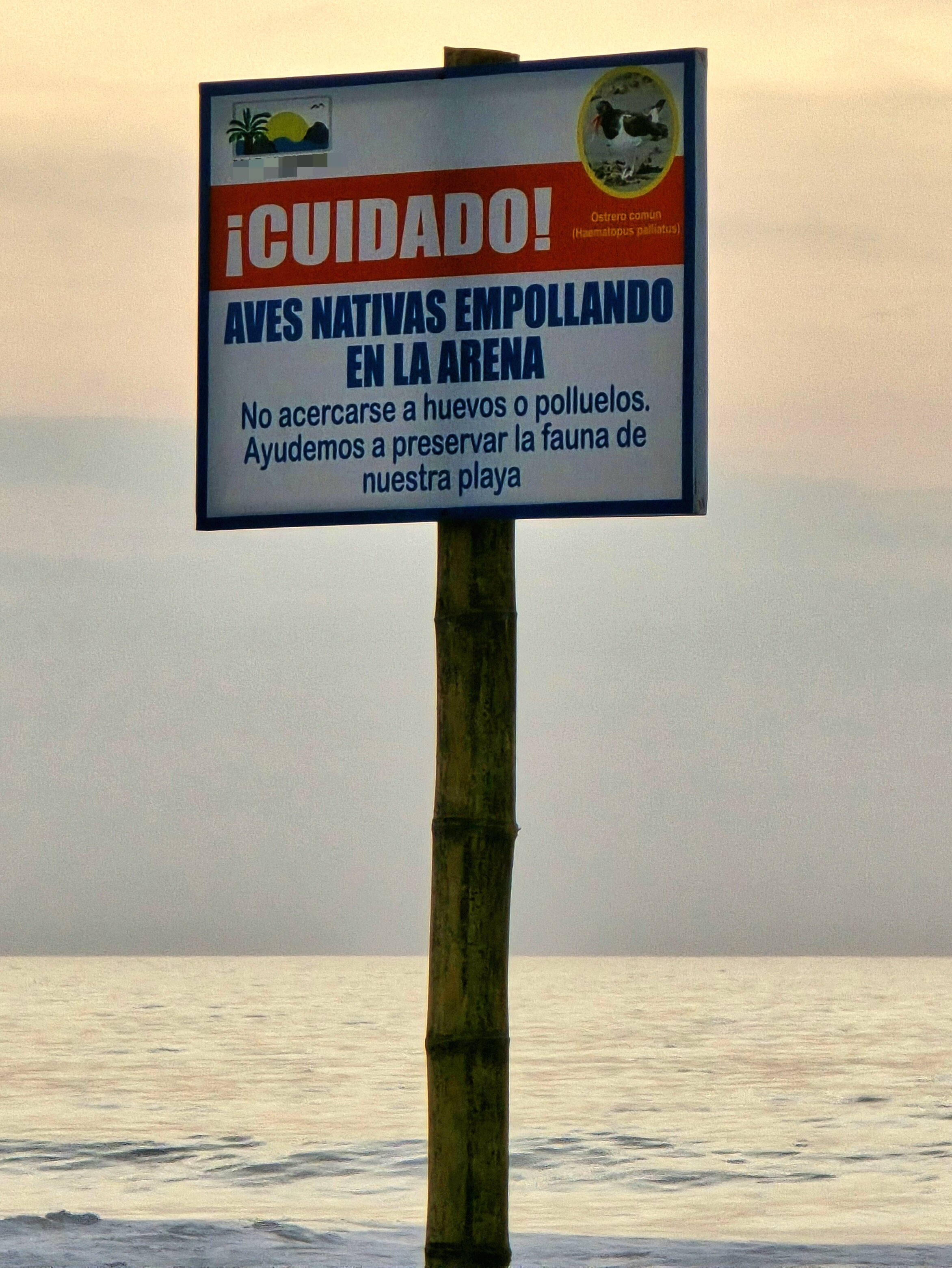
Caution! Native birds are nesting in the sand. Do not approach eggs or chicks. Let's help preserve the beach wildlife. - Source: Own
But I am not a marine biologist. I do not have a conservation background. So I started where I know how to start: by researching.
And then I found something that genuinely moved me: Island Conservation is beginning restoration work in the Chincha Islands in Peru.
I was immediately fascinated.
I thought: I would love to contribute somehow.
This small POC is the result of that thought.
In this post, I want to tell the story of that experiment:
- Why I built it
- What problem I was trying to solve
- The technical building blocks behind it
- How I structured the work
- What I managed to produce
- What I still do not know
- And why this project matters to me far beyond the code
It is a long article, but that feels appropriate. There are many hours, many dreams, and a lot of honest effort behind this work.
So, without further ado: let us begin.
Table of Contents
Why this project exists
This project began with a simple and sincere motivation: I wanted to make a small contribution to something that matters deeply to me.
Over time, it also became a way to pursue several goals at once: contributing, however modestly, to ecosystem conservation in my own country; creating a useful conversation starter with organizations such as Island Conservation; continuing to grow in data science, machine learning, and AI through a problem that feels real; stepping into a domain where I had no prior experience and learning by doing; and trying to align technical work with personal values.
That last point matters the most.
I do not believe every project has to save the world. But I do believe that when we can aim our skills toward work that has meaning, we should at least try.
This POC is one of my attempts.
The problem: if restoration begins, how do we measure progress?
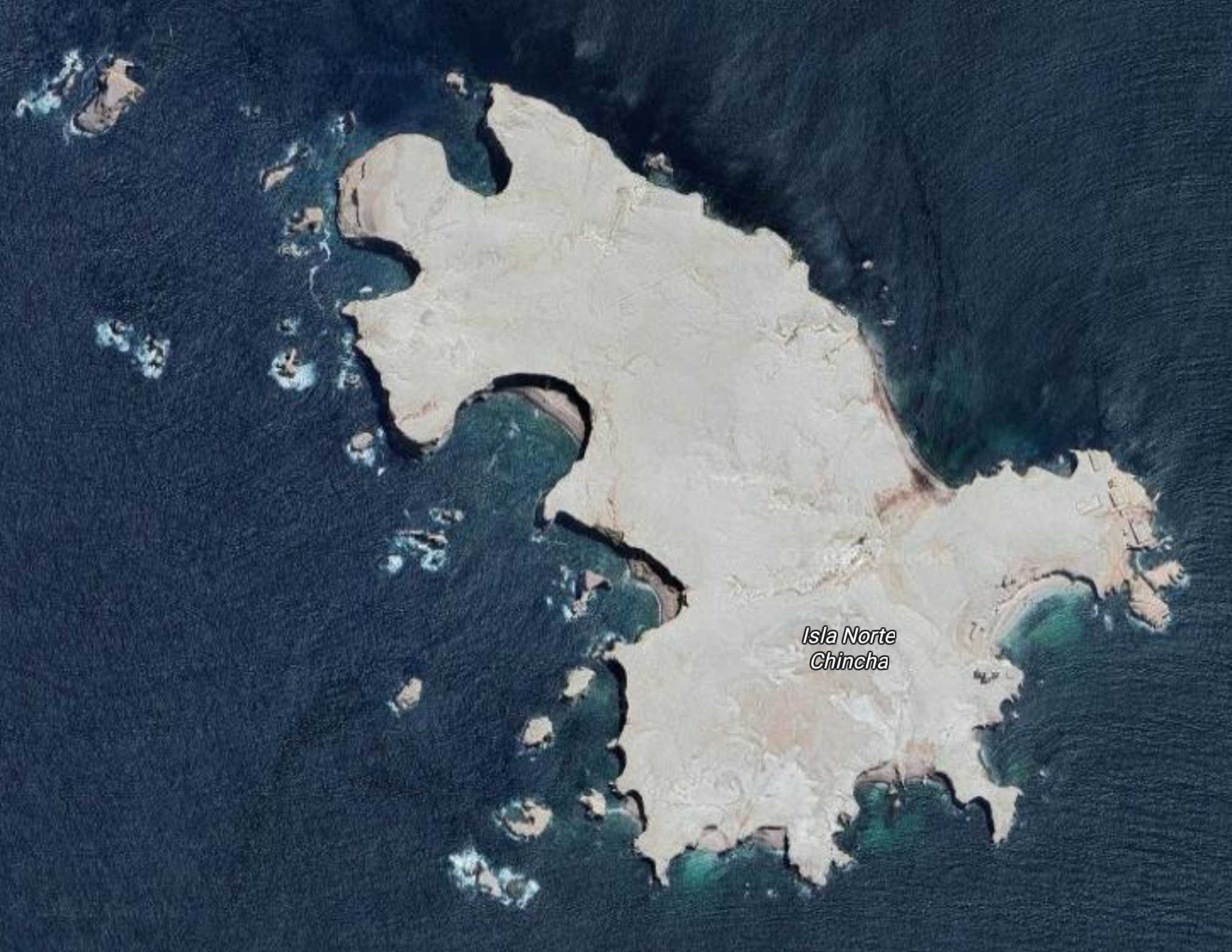
Chincha Norte Island, Perú - Source: Google Maps
Once I learned that restoration work was starting in the Chincha Islands, a practical question emerged immediately:
If restoration starts now, how will we know later whether it is working?
That question is where data science enters.
When an ecosystem intervention begins, what you need first is not a fancy model. You need a baseline.
A baseline is a reference state: a documented “before” that allows you to compare against future observations.
Without that baseline, any later claim becomes weak. Are birds returning? Are colony areas changing? Is pressure increasing or decreasing around the island? Are monitoring devices placed in the right areas?
To answer those questions later, you need something measurable now.
That was the objective of this POC:
- Establish a small, reproducible 2025 baseline
- Do it with open or accessible data
- Keep it honest about its limitations
- Make it understandable for both technical and non-technical readers
Maybe this is a naïve baseline. That is fine.
I am sure real experts in conservation and seabird ecology know how to build a much stronger one. This is not an attempt to replace that expertise. It is my grain of sand: a technical pilot built in good faith, with rigor, humility, and curiosity.
The technical ground: what domain are we stepping into?
Before writing code, I had to understand the terrain (not just the island), but the problem space itself.
This project sits at the intersection of geospatial analysis, remote sensing, environmental monitoring, scientific uncertainty, and software engineering
If you are not familiar with these areas, the easiest way to think about them is as layers.
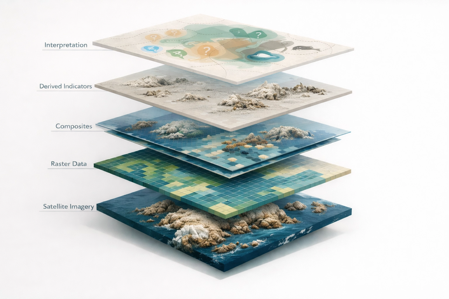
POC technical ground - Source: Own
Layer 1: Satellite imagery
At the base of the project is satellite imagery.
I used Sentinel-2, a European satellite mission that captures images of the Earth in multiple spectral bands. That last part is important: satellite imagery is not just “a photo from above.” It is a stack of measurements captured at different wavelengths.
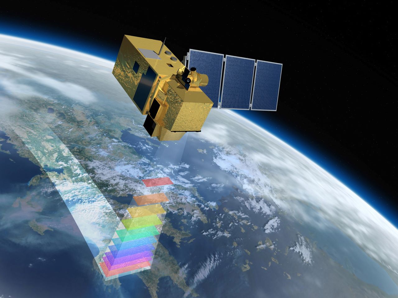
The Sentinel-2 satellite - Source: ESA
That means each pixel can contain information from multiple bands such as Blue, Green, Red, Near infrared (NIR), and Short-wave infrared (SWIR).
Those bands behave differently depending on what is on the ground (vegetation, water, rock, clouds, possibly guano-like surface deposits, etc.).
That is why satellite imagery is useful for environmental work. It can reveal patterns that are not obvious in a normal RGB image.
Layer 2: Raster data
These satellite measurements are stored as rasters.
A raster is just a grid:
- Rows
- Columns
- One value per pixel
If you have worked with spreadsheets, it is similar in spirit, but tied to geographic space. Each cell corresponds to a location on Earth.
In practice, most of the project is about reading, aligning, transforming, and comparing rasters.
Layer 3: Composites
A single satellite image is rarely enough.
Clouds, haze, light angle, noise, and random conditions can distort interpretation. So instead of working with one scene, I built seasonal composites. These composites are the product of gathering several scenes from a defined time window, align them to the same grid, and combine them using an aggregation function (in this case, using a median).
This produces a more stable “representative” image for a given year.
It is still not perfect, but it is much more robust than relying on a single observation.
Layer 4: Derived indicators
Once you have clean, aligned composites, you can compute indices and proxy layers.
These are transformations of the original bands intended to highlight particular surface characteristics.
For example:
- NDVI helps detect vegetation-like behavior
- NDWI helps detect water-like behavior
In Chincha Norte, I was not trying to detect forests. The island is rocky, dry, and desert-like. But NDVI and NDWI still help because they let me exclude signals I do not want (vegetation-like and wet/water-like behavior).
Then I can narrow the search to likely dry, non-vegetated surfaces.
Layer 5: Interpretation under uncertainty
This is where the work becomes less mechanical.
At first, I approached the problem with a remote-sensing instinct: if guano is bright and the substrate is dry, perhaps a simple brightness-based proxy could help identify candidate zones.
But reality on these islands is more nuanced.
As I reviewed videos, public references, and imagery, it became clear that the visual signal is far from consistent. Fresh or recently exposed guano can appear light, but older deposits often shift in color over time. Dense bird colonies may show up as pale or dark patches depending on the species and how tightly birds are clustered. At the same time, rocky or dusty substrate can produce similar visual patterns, making it easy to confuse natural surfaces with biological activity. And ecologically plausible bird-use areas are not always restricted to the immediate coastline.
In other words, the project cannot simply be reduced to “find the white pixels.”
A more realistic framing is to treat the analysis as a conservative screening process, one that combines multiple weak signals, documents uncertainty explicitly, and avoids presenting the output as ecological truth.
Rather than seeing that uncertainty as a weakness, I came to see it as part of the lesson. Work like this is less about extracting perfect signals and more about learning how to reason carefully when the data refuses to be clean.
The baseline I chose to build
With the domain somewhat clearer, I needed to define a scope that was realistic, useful, technically feasible, and small enough to finish. I landed on three practical layers:
- Guano proxy baseline + change (2020 vs 2025)
- Terrain and sensor-siting baseline
- Near-island vessel activity context
The core of the POC is still the first one.
Guano proxy baseline
This is an exploratory proxy built from Sentinel-2 seasonal composites.
It uses spectral bands, NDVI/NDWI filtering, and a simple score combinations designed to capture fresh-like and aged-like surface patterns.
The output is a binary layer:
1 = candidate pixel0 = non-candidate
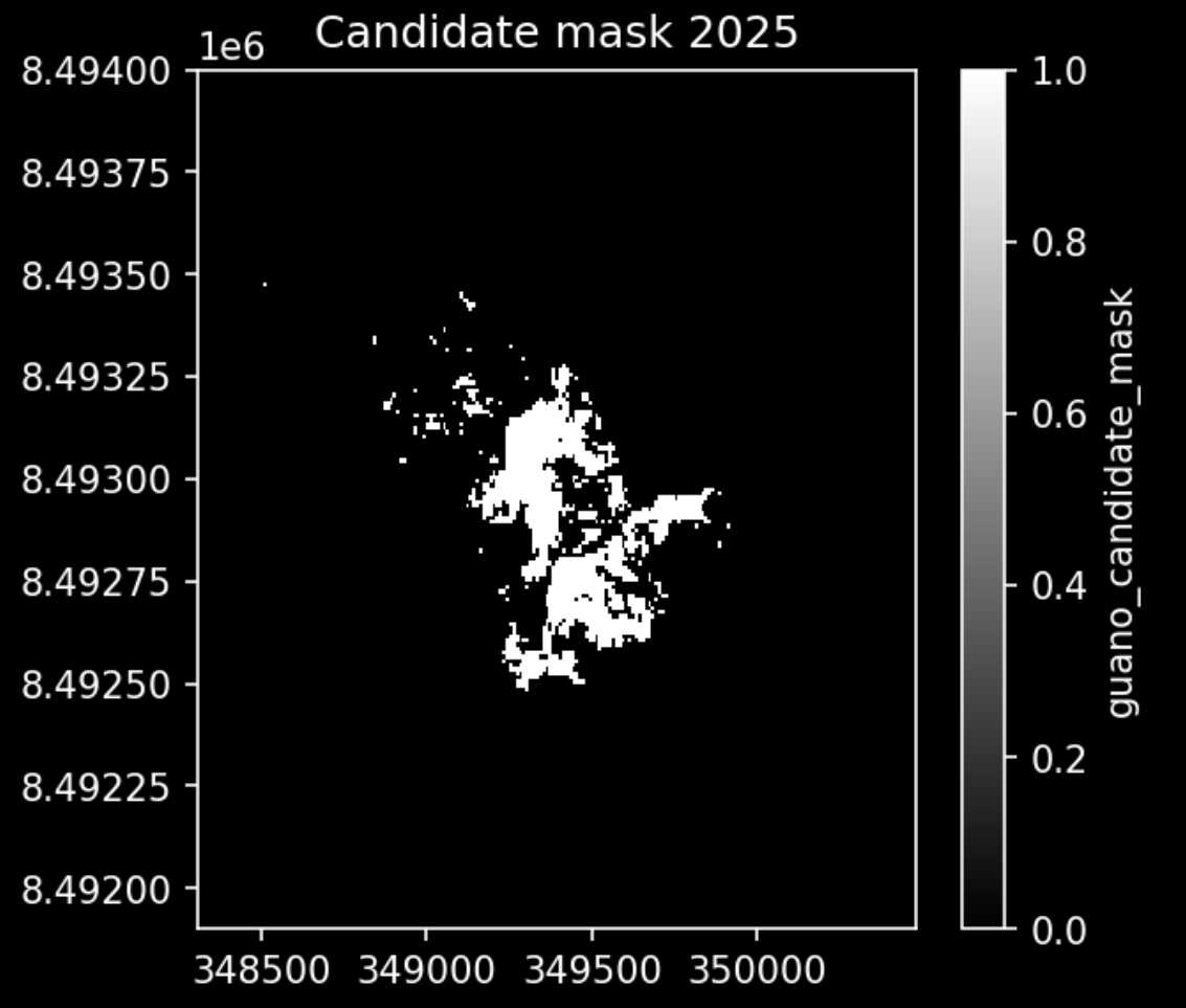
2025 Guano Candidate Mask - Source: ESA
It's a candidate mask by design. Not a guano/colony map. That name choice is deliberate.
Delta (2025 - 2020)
Once the per-year candidate masks exist, I compare 2025 to 2020.
This creates a simple change layer that helps answer:
- Where did the proxy signal appear stronger?
- Where did it weaken?
- Where did it stay stable?
Again, not ecological truth. But a useful screening comparison from satellite imagery.
Terrain and sensor siting
If restoration and monitoring are going to continue, a baseline shouldn't just describe the surface. It should also support future field work.
So I added a terrain workflow based on Copernicus DEM (a public, high-resolution 3D map of the world's surface created from satellite data).
Using elevation, slope, roughness, and distance to coast, I created a ranked shortlist of 10 candidate audio sensor locations.
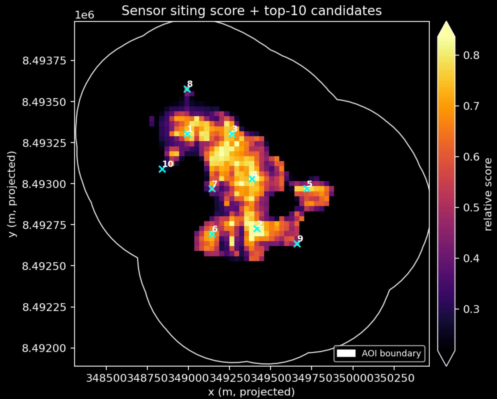
Sensor Sitting Score, Top 10 - Source: ESA
The goal is to give field teams a starting point: basic insights to help identify the most promising spots.
Vessel activity context
Human pressure matters too.
Using publicly accessible Global Fishing Watch presence data, I created a descriptive context layer for near-island vessel activity:
- Monthly series
- Coarse cumulative heatmap
Vessel activity near the islands is a stress-factor against natural environment that can help to provide extra context for conservation teams.
Together, these layers create a small but coherent baseline package.
Why the baseline matters
The baseline is not just a technical output. It is the bridge between intervention and evidence. If restoration is happening, future teams will need to ask what changed after the intervention, what stayed the same, which areas deserve closer review, and which signals are promising versus likely noise. That is exactly the kind of question data science is good at: establishing reference conditions, tracking change over time, making uncertainty explicit, and supporting decisions with structured observations.
That is why, even if this POC is modest, I think it is worth doing.
Building the project like a software project
One thing I care about deeply is that technical work should be both exploratory and disciplined.
Even when a project is small, I like to structure it as a real engineering effort.
After defining the goal, I treated the work like a proper development project. That meant organizing it with issues, branches, milestones, and regular iterations, while keeping documentation, notebook outputs, commits, and pull requests as part of the workflow.
That may sound excessive for a small POC, but I do not think it is.
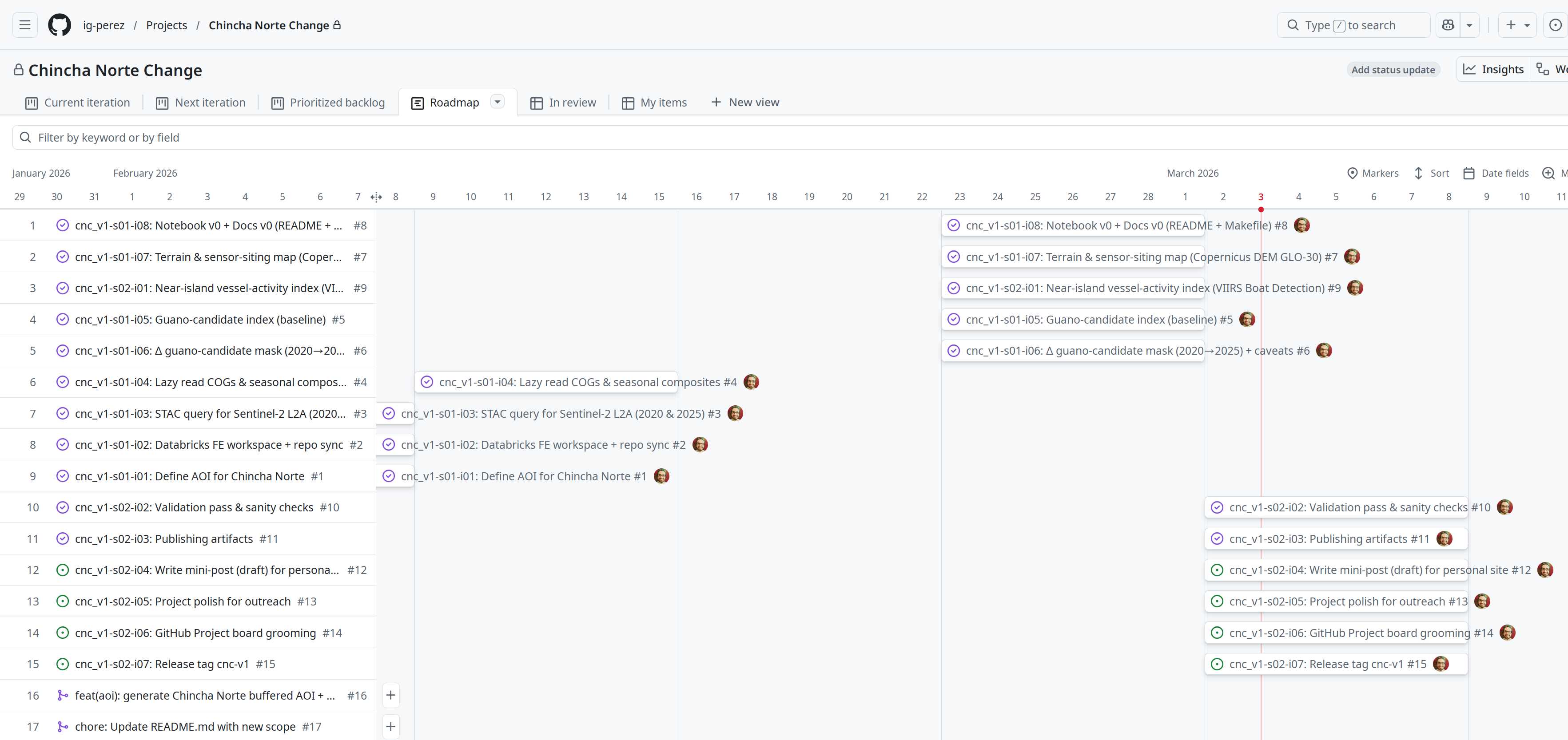
POC project management with GithHub Projects - Source: Own
Good structure helps in three ways. It makes the work reproducible, reduces chaos as the project grows, and turns the experiment itself into something that can be shared as part of a portfolio.
In other words: the process is part of the result.
The scope
I broke the project into a sequence of small issues:
- Define the AOI
- Query Sentinel-2 data
- Build seasonal composites
- Compute indices and candidate masks
- Compute change layers
- Add terrain and sensor siting
- Add vessel context
- Add validation
- Package artifacts
That structure helped me keep moving even while learning a new domain.
I relied on a stack that felt familiar:
- Python,
uv, and pandas
xarray, rioxarray, rasterio, geopandas- Jupyter notebooks
- Git + GitHub
- issue branches + pull requests
And, importantly, I also used coding agents and AI support as part of the workflow.
That is important to me because I believe AI is making it far more realistic to enter domains that once felt inaccessible. Not by replacing expertise, but by reducing friction. It enables faster exploration, quicker iteration, better documentation, and fewer dead ends. If it helps the process so much, why not use it to build a better product?
I still had to define/think through the problem, make tradeoffs, review outputs, and correct mistakes. But AI made the path more navigable.
Learning by doing
This project reflects how I tend to learn. I usually don’t start by trying to master all the theory before building something.
Instead, I begin with the problem, build a rough first version, and let the gaps show up along the way. From there I go deeper where the project pushes me to go deeper, adjusting things as I learn more.
This project followed that pattern.
Along the way I had to learn how Sentinel-2 data is structured, how to build usable composites, how geospatial alignment works in practice, and what guano might look like as a remote-sensing signal. I also spent time thinking about how to validate a weak proxy without claiming more than the data can really support.
Several early ideas turned out to be too simple. Validation was one example.
At first, I assumed that plausible candidate areas would tend to appear closer to the coastline. It seemed reasonable, but after looking at more imagery and ecological context the picture became more complicated. Bird-use surfaces can appear inland, colonies sometimes form on flat rocky terraces, and dense bird aggregations and guano staining can show up as different kinds of signals.
So I changed the validation approach.
Instead of leaning on a distance-to-coast metric, I moved toward simpler checks: whether candidate areas form coherent patches, and whether those patches fall on surfaces that look plausible when overlaid on imagery.
That kind of adjustment felt important. When an assumption didn’t hold up, it was better to change the method than try to make the result fit.
What the current POC produces
At the moment, the project produces a small but coherent artifact set availabe in this chincha-norte-baseline-poc repository.
Main notebook
The center of the repo is the audience-facing notebook chincha_norte_mvp.ipynb available here.
It walks through:
- The guano proxy baseline
- The delta comparison
- Terrain and sensor-siting
- Vessel context
- Lightweight validation and biases
Main figures
The notebook exports a compact set of shareable PNGs:
- A quick view of the guano baseline and delta
- A terrain + sensor siting figure
- A patch-coherence validation figure
- A visual overlay of the 2025 candidate mask on the RGB composite
Portable vector output
For field-planning value, the project also exports a GeoJSON with the top 10 candidate sensor locations
This is not a huge deliverable package, but it is enough to communicate something concrete.
What the POC does not do
This part is just as important as what it does.
It does not:
- Provide field-validated ecological labels
- Confirm true guano polygons
- Identify bird species
- Prove causal ecological change
- Replace conservation expertise
- Replace marine biology
- Replace field observation
It also currently uses a small Sentinel sample (due to computational power limitations), which means:
- The baseline is useful as a prototype
- But still weak as a formal scientific product
The validation lesson that mattered most
The most valuable thing I learned in the later part of this project was not a library trick or a plotting technique. It was this:
A useful model is not always the one that confirms your first intuition. Sometimes it is the one that forces you to refine it.
Early on, I assumed that distance to the coast could serve as a strong sanity check for candidate pixels. But as I looked more closely at ecological context and imagery, that assumption proved too narrow.
What mattered more was not strict coastal proximity, but whether the signal formed coherent, plausible patterns on surfaces that birds might realistically use.
That shift in perspective reshaped the validation approach, and ultimately made the POC stronger.
Why this project is personal
This POC is technical, but it is not only technical.
It is personal because it sits at the intersection of a few long-running interests in my life: learning, building things with computers, a fascination with the sea, and a growing desire to work on problems that matter. It also reflects something I increasingly believe, that software and data can still be used in service of something larger than efficiency.
I do not know yet whether this project will lead to a real collaboration with an organization like Island Conservation.
Maybe it will. Maybe it will not.
But even if it does not, it has already done something important for me: it turned a vague interest into something concrete that I could actually work on.
What comes next
This post may turn into a small series. There are several threads worth expanding: a deeper look at the remote sensing concepts behind the work, a walkthrough of the implementation journey issue by issue, the validation tradeoffs and what I would improve next, how this could evolve into a more production-ready monitoring baseline, and how AI-assisted technical work is changing what solo builders can realistically attempt.
For this specific project, the next natural steps are more concrete:
- Strengthen the optical baseline with more scenes and better sensitivity checks
- Refine the ecological validation with stronger references or field-informed feedback
- Publish the repository outputs more clearly for outreach and reuse
- Continue the series with follow-up posts documenting the process
- Keep exploring ways to connect technical work with real conservation efforts
Final reflection
I'm not a marine biologist or a conservation expert. But this project reminded me that people from outside a field can still contribute something: time, energy, technical tools, and a willingness to learn.
That's really what this proof of concept is: a small attempt to see whether these methods can help surface something useful.
If it does, even in a small way, I'd be glad to have contributed.
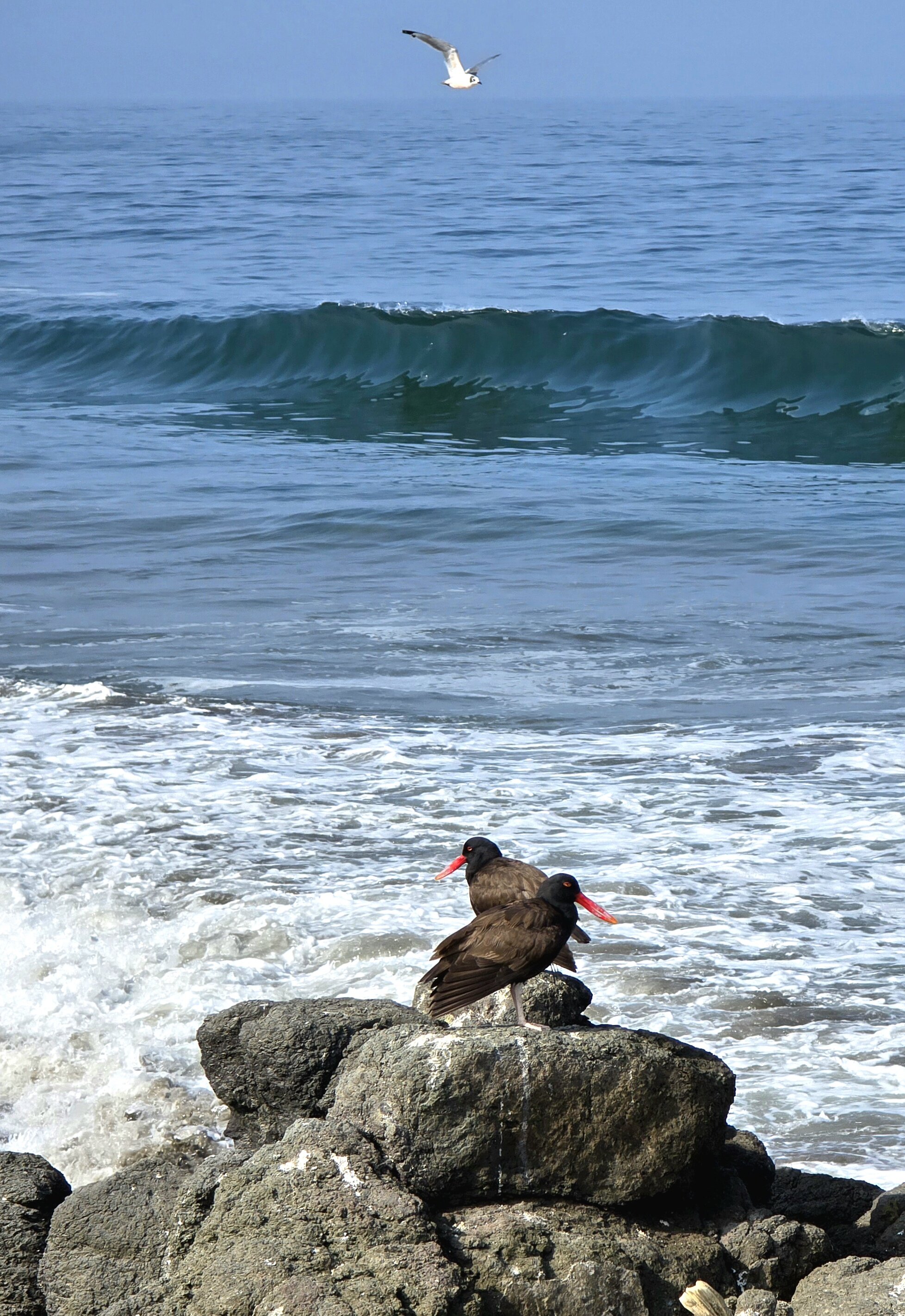
Southern Peru seabirds - Source: Own
If you read this far, thank you.
And if you work in conservation, restoration, ecological monitoring, or geospatial analysis around these kinds of problems, I would be glad to talk.